Richard Hughes recently posted about the recent GNOME3 Power Settings design that got a lot of people (myself included) hot and bothered. As I said in my comment, I think that a lot of people prefer that their laptop stay on when the lid is closed. There are clearly other who, like myself, would prefer to maintain the normal behaviour when an external monitor is plugged in.
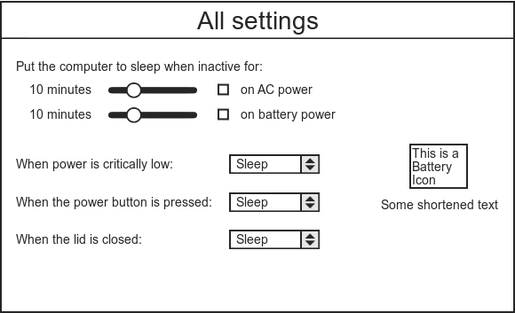
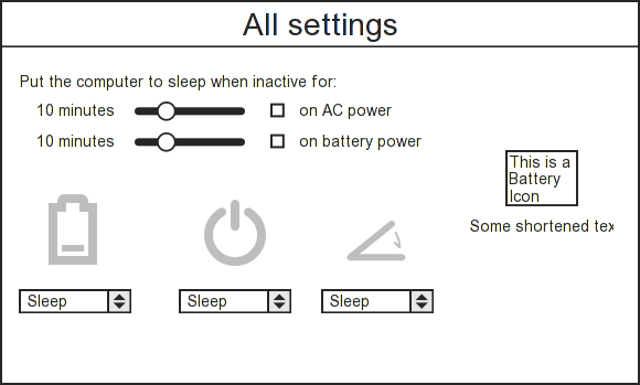
So Nirbheek Chauhan and I designed a couple of quick mockups that I think would work well. This doesn’t address customising behaviour with an external monitor, but I don’t feel nearly as strongly about that being hidden in dconf-editor as I do about the rest.

My mockup

Nirbheek's mockup
While Nirbheek’s version looks decidedly prettier, I think the meaning of the icons is not absolutely obvious. This might be solvable by some explanatory text above and mouse-overs.
While doing all this, though, it’s clear that it is really hard to design a UI that you think will please enough people, and really easy to make assumptions about what “people” want and how they use their computers. So kudos to the GNOME3 UI designers for taking up this difficult job and I hope they take all the feedback flying around in a positive spirit (even if the messages are often not quite positive-sounding ;) )