Richard Hughes recently posted about the recent GNOME3 Power Settings design that got a lot of people (myself included) hot and bothered. As I said in my comment, I think that a lot of people prefer that their laptop stay on when the lid is closed. There are clearly other who, like myself, would prefer to maintain the normal behaviour when an external monitor is plugged in.
So Nirbheek Chauhan and I designed a couple of quick mockups that I think would work well. This doesn’t address customising behaviour with an external monitor, but I don’t feel nearly as strongly about that being hidden in dconf-editor as I do about the rest.

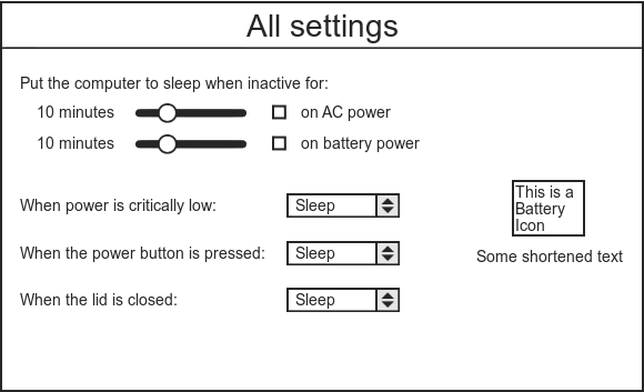
My mockup

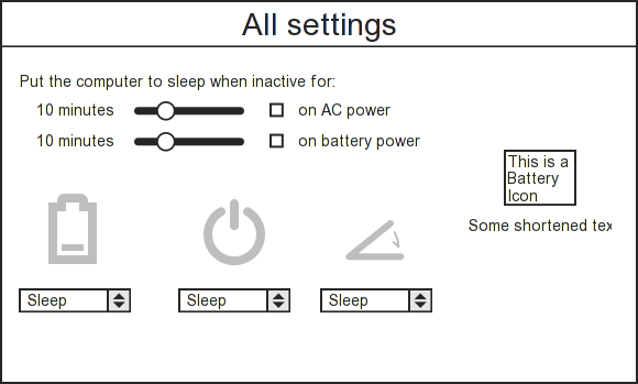
Nirbheek's mockup
While Nirbheek’s version looks decidedly prettier, I think the meaning of the icons is not absolutely obvious. This might be solvable by some explanatory text above and mouse-overs.
While doing all this, though, it’s clear that it is really hard to design a UI that you think will please enough people, and really easy to make assumptions about what “people” want and how they use their computers. So kudos to the GNOME3 UI designers for taking up this difficult job and I hope they take all the feedback flying around in a positive spirit (even if the messages are often not quite positive-sounding ;) )
Olivier Crête
February 3, 2011 — 3:15 am
Maybe another approach that would work for everyone is to start a timer when the lid is closed and only suspend after X minutes.. which could default to like 30 seconds or something, but could be increased to like 5 minutes or even “never” at the other end of the slider.
Also, the thermal management should forcefully suspend the laptop if its getting too hot (but that’s probably an issue for the kernel).
Jason D. Clinton
February 3, 2011 — 7:52 am
People suggesting this have no idea what they’re talking about. Assuming for a moment that the only temperature you’d care about was the CPU, where are going to get information about what temperature is critical? An 11″ ultraportable and a 17″ gaming laptop are entirely different beasts.
Now returning to the system as a whole: we have no way at all to get reliable temp. data from GPU’s or what their critical level are and no way at all to get reliable system chipset data or what their critical levels are.
Hell, even IPMI, which is only available on servers and was supposed to solve this problem in a standardized way, doesn’t use the same text labels from one motherboard to the next and often the critical values exposed by IPMI are so completely ridiculous that if you honored them, your server would melt before the OS took any action.
Really, it seems to me that the only room for discussion here is what to do about lid-close-while-on-AC. All this talk about the inconvenience of interrupting your IRC session while walking from one room to another is just the kind of use-case which points to a user who knows how to open dconf-editor and knows NOT to just close the lid and slam their laptop in to their laptop bag.
Olivier Crête
February 3, 2011 — 11:37 pm
The other idea about not interrupting IRC sessions is to have the IRC client just ignore the NM stuff and keep the TCP connection open. So when it reconnects, if it is on the same network, dhcp should give it the same IP address and it can continue.
Florian Ludwig
February 3, 2011 — 3:36 am
Why is there a checkbox in front of “on AC power” ? After thinking about if for a moment i guess : it deactivate the inactive mode completely?
If so, why its not in front of the setting?
Arun
February 3, 2011 — 10:38 am
I went with what I thought was feasible in GTK+. I also considered whether moving the slider all the way to the left should mean “never”, though I thought that I might counter-intuitive.
Florian Ludwig
February 3, 2011 — 1:44 pm
What happens if its not checked? Is the slider adjustable?
Why does the slider all to the left mean never? Dragging it to the left reduces the time until the computer is put to sleep.
Lets assume the checkbox is not present (or I am a user who doesn’t get it or see it): My computer goes into sleep mode after ten minutes, which is to early for me. Looking at the menu I don’t see a way to deactivate this behavior. As 10 minutes it too early for me (i would even prefer never) I would drag the slider all to the right.
Still its a bit strange to duplicate the functionality of the checkbox.
Arun
February 3, 2011 — 1:46 pm
Agreed, all the way to the right makes more sense.
Florian Ludwig
February 3, 2011 — 3:00 pm
Would be interesting to do some tests if users would discover that functionality if the checkbox wouldn’t be there at all.
Simon
February 3, 2011 — 3:39 am
I think either of those mockups is reasonable, though I prefer the text version for the same reasons you give. They both cover the most common things I’d want to customise, and the layout is compact enough that fitting a small netbook screen shouldn’t be an issue.
Nico
February 3, 2011 — 3:47 am
What is wrong with the existing2.x power management panel in the first place?
Brad Hards
February 3, 2011 — 3:59 am
Why keep the sliders for specifying time? A dialog box (spinbox / pulldown / combo box, whatever) would be easier to operate and more flexible.
That would also give you an option for “never” and you wouldn’t need the checkbox (which already confused a previous commenter).
Arun
February 3, 2011 — 10:39 am
I’d imagine a slider can be just as flexible if you the stops roughly correspond to the drop-down options. The sliders were Nirbheek’s idea and I think they go quite a way in uncluttering the dialog.
Nirbheek Chauhan
February 3, 2011 — 4:05 am
I should point out that the option that is missing in these mockups is:
When the sleep button is pressed: [ Sleep ]We agreed that the sleep button should… well, cause a sleep (aka suspend-to-ram). I now think that we should not workaround deficiencies in the kernel using UI, and should do both suspend-to-ram as well as suspend-to-disk. If the kernel can’t do that, we should make sure it can. After all, that is the official stance for suspend problems, sound problems with pulseaudio, and OGL driver problems with GNOME-Shell.
In any case, people who really want to shutdown when the sleep button is pressed should use dconf-editor.
Adam Williamson
February 3, 2011 — 7:22 am
Wouldn’t be enough for me; I want it to turn the screen off when I close the lid on AC power, and suspend when I close the lid on battery power :/. in fact that’s always seemed like the only sane way to do it, for me…
Luca Ferretti
February 3, 2011 — 7:35 am
A quick note: don’t forget l10n/i18n in design. See https://bugzilla.gnome.org/show_bug.cgi?id=640119
Erick
February 3, 2011 — 9:45 am
I know they’re only mockups, but the power icon is terrible. It should be something like this:
http://www.clker.com/cliparts/e/0/7/1/1197123164299010126JPortugall_icon_bus_bar.svg.med.png
That shape would mean more to users. The other… Means shutting it off or something – it’s confusing. Just saying… Don’t let it carry thru to implementation. Thanks.
Arun
February 3, 2011 — 10:42 am
But it does mean shutting it off – the option is “what do you want to do when the power button is pressed”.
Francisco
February 3, 2011 — 5:36 pm
Based on the meltdown problem and the varied uses a laptop might have, I think adding the preference for the lid closing is just 1000% necessary.
Eric Wood
February 4, 2011 — 9:28 am
I agree with Adam W. I’ve had users close the lid and slide the laptop in a carrying case which caused the laptop to suffocate and overheat. The user routinely thinks the setting is set to shutdown or hibernate. Wrong! An audible beep should happen if a laptop doesn’t power down when overheating (like inside a bag) – on ac or battery. Also, if a shutdown procedure (init 0) starts, closing of the lid should do nothing. On windows laptops I’ve had shutdowns be suspended because of the closing lid – which is crazy. Users would open the laptop up just to see the laptop resume the shutting down process. Amazing! Test it out.
Wrecks
February 4, 2011 — 6:11 pm
Let me put myself into as a user: I decide to change the inactive time after my machine sleeps. I would like to set it as 15 minutes. I drag the slider around. It jumps around 15. 12..18.. But I want 15. I need an input field to type that in. There is none. Isn’t that frustrating?
Sliders are useful for changing volume, deciding a magnification factor etc. I am not sure if it is suitable in this context.
James E. LaBarre
February 5, 2011 — 1:11 am
NOT a good idea if you have a T40-series ThinkPad. If the system goes into Hibernate, the only way to get it back out is to dismantle the laptop and pull the CMOS battery. A serious design default, I know, but with the large number of those in the wild, it has to be addressed.
dE_logics
February 14, 2011 — 1:34 pm
Why work for Gnome3? The team is Notorious and Gnome Shell is a failure.
gabriel
December 11, 2011 — 11:58 am
Honestly, what was bad about gnome 2 power settings screen?
i could do at least 7 things I can’t do with BOTH of those screens summed!
know this sound harsh and now my comment will be ignored as flame, but to the outsider, the impression is that gnome became a circle jerk :(